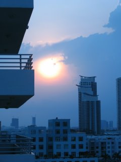
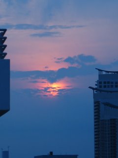
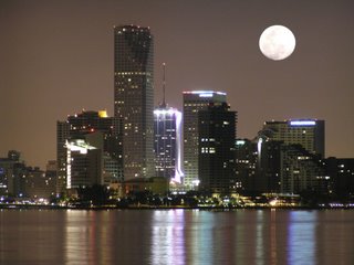
This is a glimpse behind the scenes of Leo Burnett's quarterly Global Product Committee meetings. Four times a year, 30 Creative Directors from around the world gather to judge advertising and award the best work produced by the LB global network. This quarter's destination: South Beach, Florida...

Saturday, May 20, 2006

Day 4 - Wrapping Up A Week of Work...

Finished up the meeting strong, in the early afternoon, and managed to slip away to catch a few hours of Miami sun on the beach adjacent to our hotel. The rays were beaming down with a vengeance, and I got a few shades browner after just two short hours. There’s nothing like finishing up a GPC, there’s a sense of accomplishment that doesn’t really compare to anything else I can think of. Over the course of a week, we watch anywhere from 500-1000 ads, chew over them, digest them, and pick out the morsels that demonstrate the deepest, most fundamental elements of our global collective identity. What initially feels a little like a prolonged exercise in self-flagellation ultimately ends up as an affirmation, a restatement of our principles, a declaration of our intent to manifest the “best in the world, bar-none.” It can be a rough journey, as we often pore over work that is preposterously out of line with our elevated standards, but ultimately, we always discover a collection of gems from across the world that represents the best of the Burnett brand...

Friday, May 19, 2006

Big Ideas from Lil' Offices - Europe Throws Down...

We saw an inspiring collection of stunning, inspiring, and powerful ads from Europe today. The work from Milan and Lisbon, in particular, blew the room away, and left multiple delegates running their mouths effusively about how the awards shows are bound to honor this work in the year to come. Milan’s collection of TV and integrated campaigns garnered some of the highest scores, largely because it is constructed around some of the most superb TV production to come out of our network in recent memory. The highlight was a TV ad for Ariston washing machines that features a microcosmic universe of multicolored clothes floating around like fish and sea creatures, all contained within the seemingly boundless water within the machine. The tagline: “Big Inside.” To describe this ad in words does an injustice to its exquisite art direction, because the camera work, the lighting, the music, and the visuals in general stunningly manage to capture the look and feel of a coral reef, although every element in the film is an article of clothing… It is an evocative, memorable ad, and the committee spontaneously burst into applause after viewing it for the first time. You’ll see it for yourself soon, as it promises to be on multiple award-show reels in the near future, a testament to the excellent work being produced by LB/Milan and its sudden ascent to the ranks of the most creative hot spots within the entire LB network. It’s a tribute to the strength and depth of our network that unforeseen greatness can emerge from the least predictable places, and that unlikely candidates can occasionally trump giant behemoths simply by staying true to the seamless combination of a simple idea and a painstakingly crafted execution. Congratulations to LB Milan for the Ariston work… The Pirelli tire film they offered up also scored very well, but I must confess that I can hardly write as glowing a testament to that piece, as I personally feel it’s one of the most incomprehensible pieces of narcissistic overkill I’ve ever seen. That doesn’t mean that it isn’t a fantastic example of crafting, that doesn’t mean that it’s not an incredibly powerful media device, that doesn’t mean it isn’t a groundbreaking use of new media and technology, it just means I can’t quite get my head around John Malkovich playing a Catholic priest who casts out demons from possessed cars using a tire iron as a Crucifix… But hey, that’s just me, and my opinion is a small, unimportant inconsequence in the larger scheme of things. Hell, the Pirelli campaign scored two well-deserved 8-balls, and managed to grow Pirelli’s brand immeasurably, so I suppose it doesn’t really matter what I feel about it… It is, after all, a gorgeous looking film, and the press coverage it received was priceless… Have a look at it @ http://www.pirellifilm.com/.

Lisbon and Paris also made a strong showing. The first spot we watched from Lisbon was for a Child Abuse prevention program, and considering some of the incredible, award-winning ads done in this category by agencies all over the world, it’s no small feat that the good folks from Lisbon managed to create a powerful, emotionally compelling ad that can hold its ground with anything done on this subject. The spot is entitled “Alzheimers,” and the casting, direction, and script are flawless. The commercial ends with an elderly woman gazing off into space, with a vacant look in her eyes that speaks volumes. A powerful ad, that demonstrates all the subtleties involved in telling an emotional story, and a great addition to LB/Worldwide’s growing portfolio of pro bono work for social awareness.

LB/Paris turned in a hilarious spot for Charal meats, with an accompanying in store print campaign that perfectly captures the playful tone of this client. All in all, it was a good day, with a certain excitement in the air born from the potency of the work we were canvassing. In very few GPCs in recent memory has such a diverse collection of work emerged from such a variety of offices. Generally good work tends to cluster around a few notable creative teams, which is to be expected, but when the entire network makes a strong showing, it’s a herald of good things on the horizon for the whole company…

Thursday, May 18, 2006

Garden Grove...

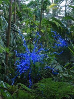
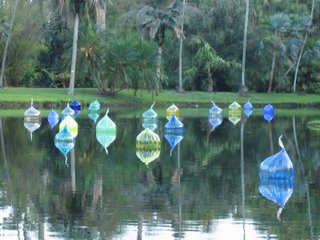
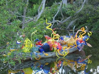
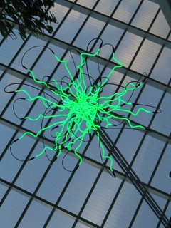
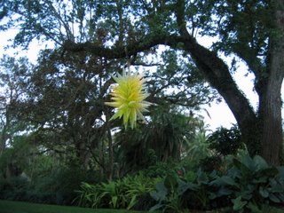
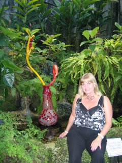
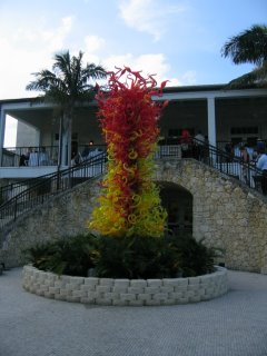
At the end of two days of voting, this group has managed to score only two paltry ads over a 7. Not a good sign. Although our revote list is growing, only rarely have we had such a dearth of 7+ work halfway through the meeting. The numbers would seemingly imply that this is a really tough, critical jury, but that’s not quite true – the work simply hasn’t merited high scores. We saw most of the work from the Americas today, and waded through some dismal predictably uninspired work for a few clients whose names shall remain obscured to protect the guilty parties involved… This group has been keeping me really busy typing out their rather elaborate suggestions to improve the sub-par work, and although it’s encouraging to see the spirit of constructive empowerment, I’m growing a bit weary of being in that room… the Sun was out today, which is probably why I was getting restless. Anyhow, after a long day of discussing and debating the merits of the work, about 15 of us boarded a bus to go visit Miami’s Fairchild Botanical Gardens, on the recommendation of Alexandre Okada, LB/Latin America’s Regional Creative Director. The gardens were featuring an art installation of blown glass sculptures, which he claimed were not to be missed. It was all the more surprising then, that he missed the trip, apparently because he had better things to do. Hmmmph. Well, after a tedious 40 minute bus ride through rush hour, we arrived at the Gardens and spent a token hour circulating through the expansive compound, taking pictures, observing the greenery, taking in the spectacle of the blown glass sculptures intertwined with vines and leaves… Here are a few pics from that trip…


Check this plant out - it blooms once every 3 years, and it happened to be open while we were there. Nicknamed "Old Stinky", Audrey III is an Amorphophallus titanium, a smelly plant about 7 feet tall that emits a wave of odor reminiscent of rotten meat every 3 to 4 minutes...

Wednesday, May 17, 2006

GPC - Day 1 Results...

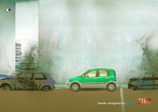
Finished up a long day of scoring ads with only a token 7+ out of the hundreds of ads we canvassed. There are a few strong 6's that are likely to score higher during our revote section, but the day was largely spent doling out mediocre scores for work that rarely moved beyond the safe familiar territory of the predictable. There were, however, a few gems, even if they didn't score particularly well. My favorite is the print ad above, from LB/Paris, entitled "Burning Cars." Although the committee ripped into it for its art direction, and pointed out multiple flaws in the lighting and design, I think the idea is bold and manages to sustain a level of humor that shows a great deal of insight into the local culture. Given the widespread troubles in France after the near-passage of its calamitous new labor laws, and the rioting that ensued immediately, it's impressive to see Fiat stake out its position as a "brand of the people." The idea behind this ad is that while the riotous French youth were busy burning vehicles to protest the dwindling economic security provided to them by the French welfare state, a lone Fiat car stands untouched, next to the burnt out hulls of other automobiles torched by the French mobs. This ad does an excellent job of leveraging Fiat's brand essence and captures its playful personality extremely well... While the committee did feel the image could have been crafted better, they were informed that this ad was rushed into production in order to air during the actual riots, a legitimate reason for not having the time to truly labor over every miniscule visual detail.... This was one of the most thought-provoking ads I saw today, and while it may not have scored a 7, it still made me smile....

What distinguishes the GPC from your average global awards show is the deconstruction that takes place, the debate and critical exchange that occurs over each ad, whether it’s a stunning Cannes contender or the ugliest, most misguided piece of half-assed scribbling you’ve ever seen. Instead of dismissing work outright, pieces are workshopped, broken down, and each step from conception to execution is analyzed in the spirit of collectively improving the ultimate product. The fact that our network values self-reflection, and our creative leaders seek out constructive criticism from their peers is one of the critical elements of LB Worldwide’s global success. We are only as good as the standards we uphold and the quality we aspire to maintain…

Clusters of Clios...


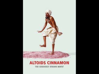
The Clio Festival finished up across town this past weekend, and the LB network managed to pull in a respectable 10 awards for a variety of executions from across the network. The strongest showing was for LB/Chicago’s Altoidia work, which won a Gold Clio for integrated campaign, and also a Bronze Clio for four of the print ads in that campaign.

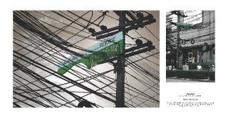
Also leaving a strong impression on the jury was the LB/Canada website, which was given a Gold Clio for Brand Building, and also received a Bronze for Fresh Approach in the Internet category. The lone Brunett winner in the TV/Cinema medium was the DFT “Camera Phone” spot from LB/London. One of the most talked about executions that received a Silver Clio in the innovative category was LB/Bangkok’s “Giant Comb” execution for P&G’s Rejoice brand. This ambient piece definitely leaves an impression on anyone who sees it…

The network was also honored by receiving a Hall of Fame Clio for 2000’s famous John West “Bear” ad, originally from LB/London. All in all, a decent showing from the network. The usual suspects cleaned up, and this gives us new insights into what the upcoming Cannes festival is likely to honor.

South Beach Diet - Day III

Breakfast:
Yoghurt, Cheese, Coldcuts, Tea

Lunch:
Salad
Chicken Breast

Dinner:
Bento Box @ Beacon Hotel:
Tempura Lobster, Ahi tuna, seared Scallop, Coconut shrimp, salad

Tuesday, May 16, 2006

Streamline Moderne - Art Deco Facades


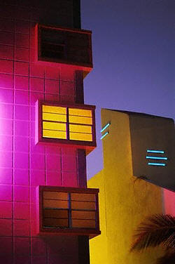
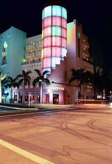
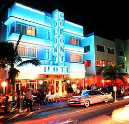
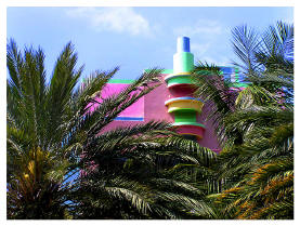
Spent most of the day at the hotel with Rosalie, setting up the meeting room and unpacking all the GPC materials. I did manage to escape briefly on an errand to buy some equipment, and on the way back to the hotel I walked along Ocean Drive, checking out the slew of South Beach restaurants and bars that make this place the legendary party destination that it is. What jumped out at me immediately was the architecture of this neighborhood, which encompasses a fantastic array of colors and shapes that stand in stark contrast to the muted aesthetic of Chicago, and its sedate midwestern procession of gray steel and plate glass. The buildings here are very different, reflecting an entirely different human relationship to space and nature. A friendly cab driver informed me that another name for South Beach is the “Art Deco District,” because so many of the buildings here were constructed in the heyday of the art deco movement that came out of Europe in the early and mid-20th century. They call this architecture “Streamline Moderne,” and it reflects a combination of industrial design elements intertwined with manufactured artistic touches, such as the liberal use of colors and the incorporation of “aerodynamic” geometric shapes to deal with high winds and weather conditions. I suppose that makes perfect sense, given the propensity of hurricanes to sweep across this area with alarming frequency. Still, while the shapely design of these buildings might have been a matter of simple functionality, the colors used for their facades are clearly a matter of choice. Pastels abound, with light pinks, baby blues, peaches and teales everywhere, as well as lavenders, orange hues, and light greens.

The bars go further, with all those same colors lit up fluorescent and neon…

It’s quite a change from Chicago, and made me appreciate anew how stodgy certain parts of the middle American aesthetic are. Things are more colorful down here, the air is muggy, the hips are looser, the skins are darker, the tongues are richer, and even the buildings seem like they’re enjoying themselves, lying respendent in the soft shades of a Carribbean sun… It's hard not to love a city that paints it's high rises pink...

South Beach Diet - Day II

Brunch:
Nikki Beach Salad

Snacks:
Assorted nuts

Dinner:
Chilean Sea Bass in Ginger Butter Sauce, Bed of Greens

Monday, May 15, 2006

Rainy Day, Dream Away...

Pictures courtesy of Rosalie Geier.


South Beach Diet - Day 1

Breakfast:
Cheese, Yoghurt, Fruit

Lunch:
Southwestern Chicken Salad

Dinner:
Ketel One Kosmopolitans @ Casablanca
Catch of the Day - Oven-roasted grouper filet w/parmesan sauce

Sunday, May 14, 2006

first night in FL...

5-14-06


A waning full moon lingers over Miami sand
South Beach torsos framed against Florida tans
Clothing is optional, skin is not:
Each of us beginning new phases within the contradictions we’re caught
I come to this mecca of hedonists to milk a network of its wisdom
To sift through the raw silt to find the gems in the system
Twisting words to meaning we gain entrance to inner sanctums
Whispering subtle strategies amidst understated brand anthems
Beneath these pulsing beats
Lurks the aristocracy of Latin heat
Hot hips & cross-pollinated tongues
A reservoir of refugee rhythms that makes dancefloors hum
Rattle & chime
South Beach a haven designed
For maverick pleasure-seekers and their one-track minds
It’s been a long time since I worshipped an ocean…

I prostrate to the Atlantic and let it caress my legs
Lapping at my landlocked years like liquor bottle dregs
the bottomless world well washes my journey away
waking beneath palm trees to greet a reborn day…