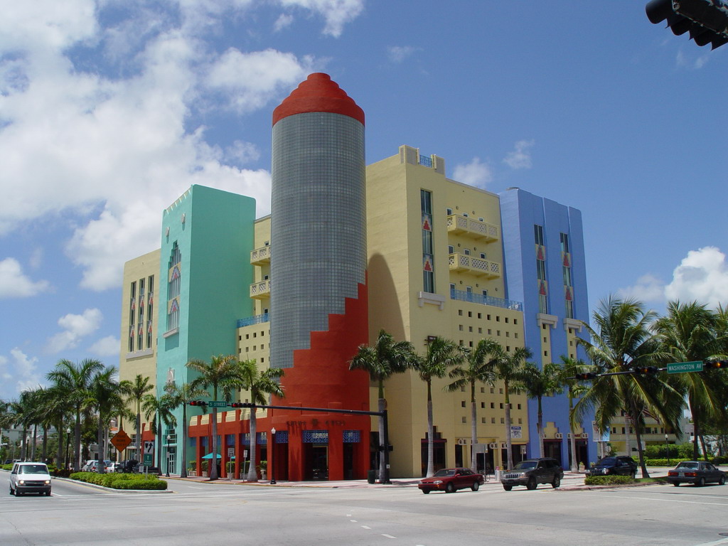
Streamline Moderne - Art Deco Facades

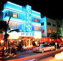
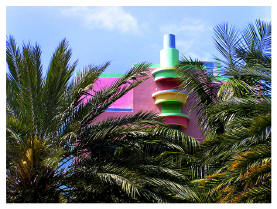
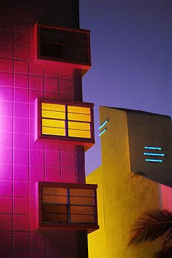
Spent most of the day at the hotel with Rosalie, setting up the meeting room and unpacking all the GPC materials. I did manage to escape briefly on an errand to buy some equipment, and on the way back to the hotel I walked along Ocean Drive, checking out the slew of South Beach restaurants and bars that make this place the legendary party destination that it is. What jumped out at me immediately was the architecture of this neighborhood, which encompasses a fantastic array of colors and shapes that stand in stark contrast to the muted aesthetic of Chicago, and its sedate midwestern procession of gray steel and plate glass. The buildings here are very different, reflecting an entirely different human relationship to space and nature. A friendly cab driver informed me that another name for South Beach is the “Art Deco District,” because so many of the buildings here were constructed in the heyday of the art deco movement that came out of Europe in the early and mid-20th century. They call this architecture “Streamline Moderne,” and it reflects a combination of industrial design elements intertwined with manufactured artistic touches, such as the liberal use of colors and the incorporation of “aerodynamic” geometric shapes to deal with high winds and weather conditions. I suppose that makes perfect sense, given the propensity of hurricanes to sweep across this area with alarming frequency. Still, while the shapely design of these buildings might have been a matter of simple functionality, the colors used for their facades are clearly a matter of choice. Pastels abound, with light pinks, baby blues, peaches and teales everywhere, as well as lavenders, orange hues, and light greens.
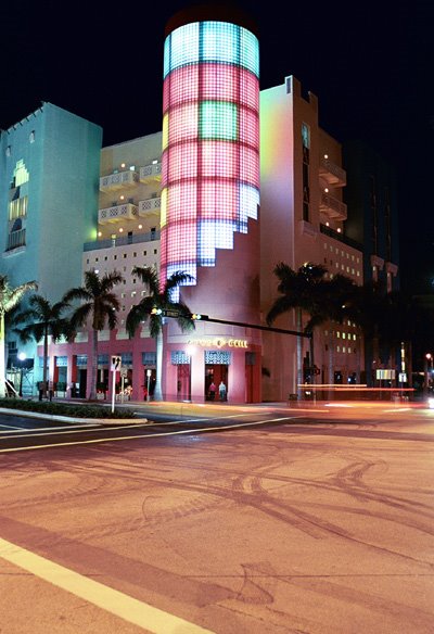
The bars go further, with all those same colors lit up fluorescent and neon…
It’s quite a change from Chicago, and made me appreciate anew how stodgy certain parts of the middle American aesthetic are. Things are more colorful down here, the air is muggy, the hips are looser, the skins are darker, the tongues are richer, and even the buildings seem like they’re enjoying themselves, lying respendent in the soft shades of a Carribbean sun… It's hard not to love a city that paints it's high rises pink...
posted by DhakFu at 6:44 PM
![]()

0 Comments:
Post a Comment
<< Home